Bundle types / Build your own
Build your own
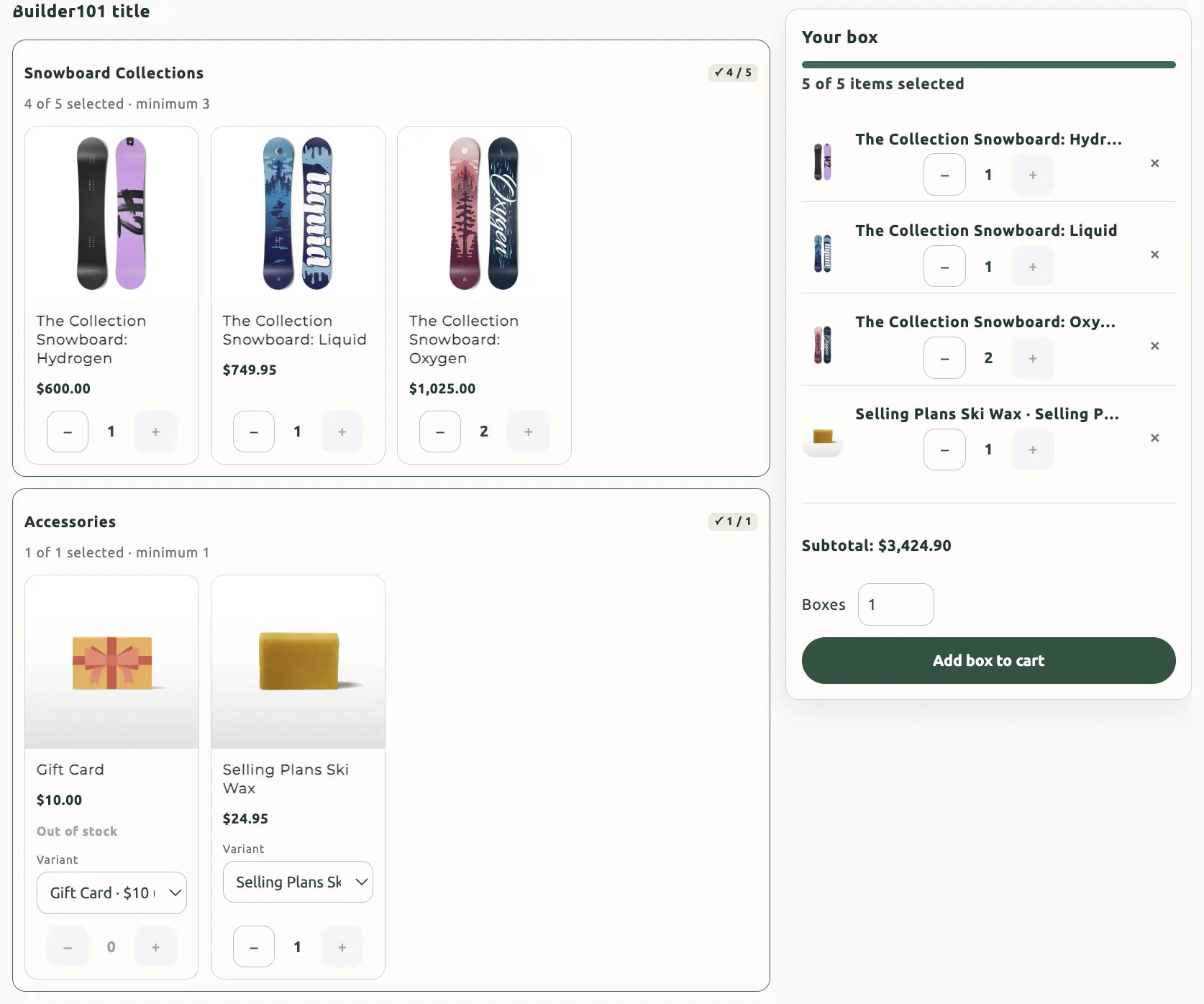
Shoppers assemble the bundle: mix and match, a fixed-size box, or a fully custom flow. You define sections, how many items they may pick, and the storefront page they build on.
When to use Build your own
Snack boxes, custom gift sets, “pick N from these groups”. Shoppers choose; you set the rails. This type always uses a dedicated product page — either one the app creates or an existing product you connect.
On this page
Name and starting point
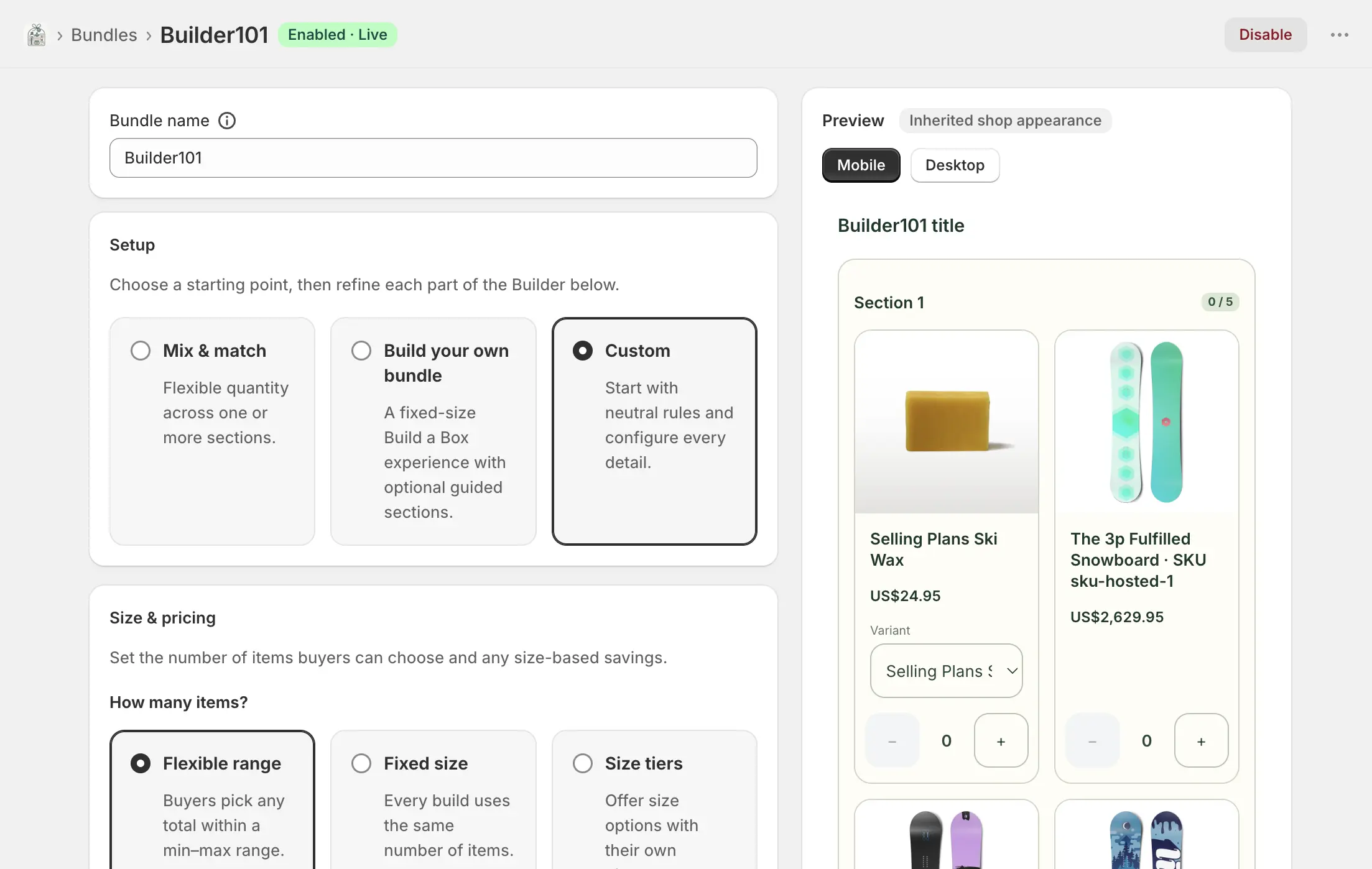
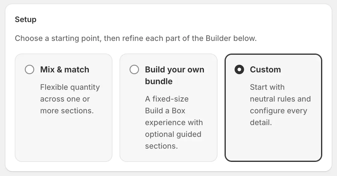
Bundles → Create bundle → Build your own. Bundle name is internal. Then pick a starting point — a preset that fills size, flow, and distinct-item defaults. Switching preset after you have configured the draft resets those style settings but keeps products, sections, and pricing.
- Mix & match
- Flexible quantity across one or more sections. Default range 3–6 items, single-page flow.
- Build your own bundle
- Fixed-size box (default 6 slots) with optional guided sections (stepped flow).
- Custom
- Neutral rules. Configure every field yourself.
Size and pricing
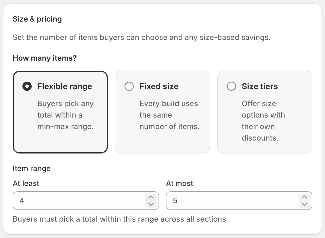
How many items a shopper must (or may) pick in total, and whether size itself carries a discount.
- Flexible range
- Min–max total across all sections. Shoppers can land anywhere in that range.
- Fixed size
- Every build uses the same number of slots (box size).
- Size tiers
- Shoppers pick a size (6 / 9 / 12, for example). Each tier has its own discount, so a single checkout discount card is hidden in this mode.
- Tier fields
- Items (slot count), discount type (percent off, fixed amount off, amount off each), value, label, and Highlight this size (one highlighted tier). Add size tier / Remove as needed.
Sections and products
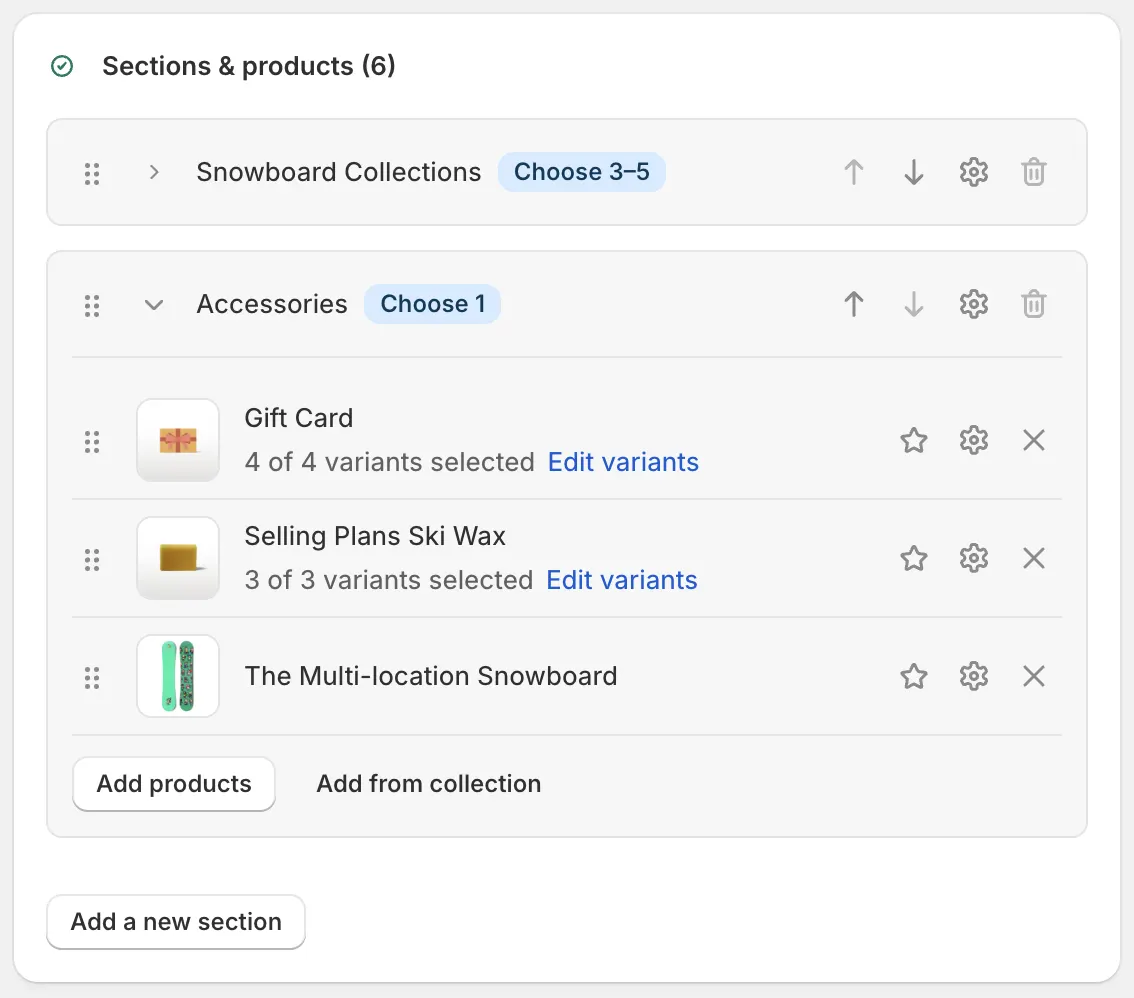
Sections are labeled groups (Snacks, Drinks). Shoppers pick from each according to that section’s bounds.
- Add a new section
- Section label (required, unique), optional description, and how many from this section (min and max).
- Edit / reorder / remove
- Settings edits the label, description, and bounds. Arrow buttons or drag change order. You cannot remove the last remaining section while products still depend on it.
- Add products
- Stock the section from the catalog. A variant cannot sit in two sections of the same builder.
- Add from collection
- Import variants from a Shopify collection into the current section.
- Per product
- Quantity, edit variants, display label, featured (shown more prominently), reorder, and optional developer internal ID.
- Search
- Filters products inside a section when the list is long.
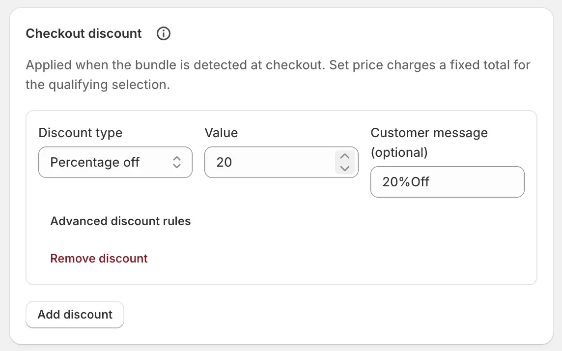
Checkout discount
Shown unless you chose size tiers (those already include a discount per size). Adds a checkout discount when the built selection is detected: percent off, fixed amount off, amount off each unit, or a set price for the qualifying selection. Optional customer message. Advanced rules (layer id, product vs order class, scope, selection, exclusive) are available if you need them — most shops only set type, value, and message.
Selection rules
- Require different flavors / SKUs
- Off by default: shoppers may add several of the same product, within each product’s limit. On: they must include a min–max number of distinct SKUs in one build.
Storefront page
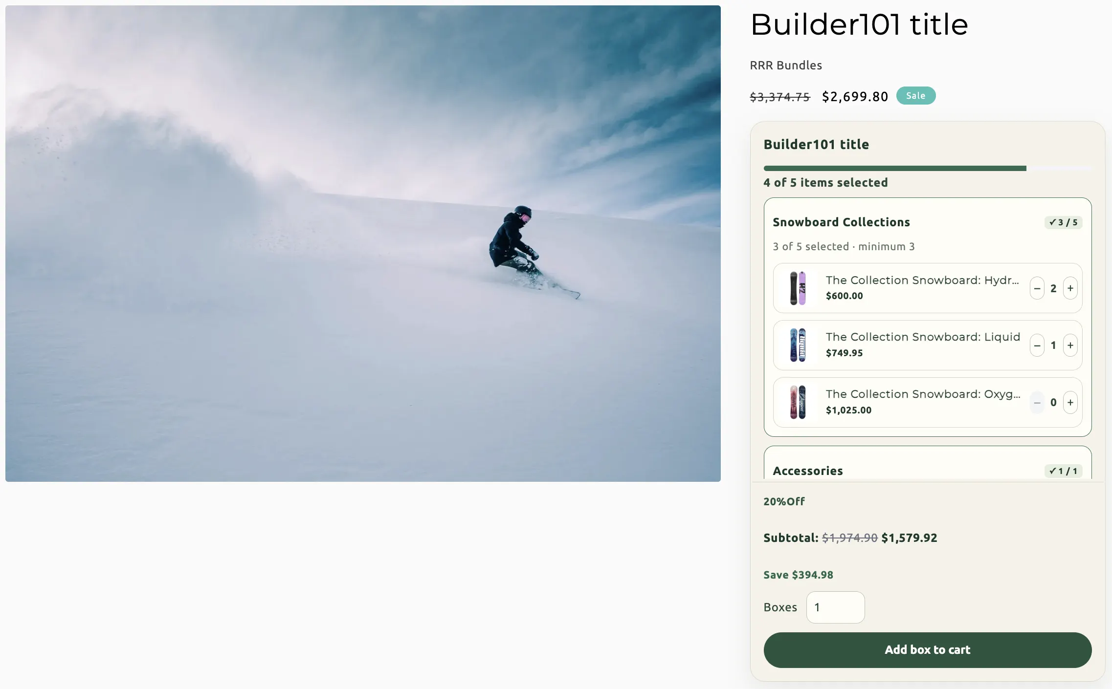
Where customers build. The builder replaces normal add-to-cart on that product.
- Create new product
- The app creates a Shopify product when you save while enabled. Set title, description, and images here (same fields as a Fixed bundle product).
- Use existing product
- Connect a product you already sell. Its add-to-cart is replaced; customers can only add through the builder. Disconnect does not delete the product.
- Compact display
- Single-column block that sits in the product page.
- Expanded display
- Wider layout with a summary panel. Requires the “Builder bundle (expanded)” app section on the product.builder template — open the theme editor, add that section, then confirm it in the app. Expanded forces single-page flow.
- Shopping flow
- Single page shows every section at once. Guided sections walks shoppers one section at a time. Guided is unavailable in expanded display.
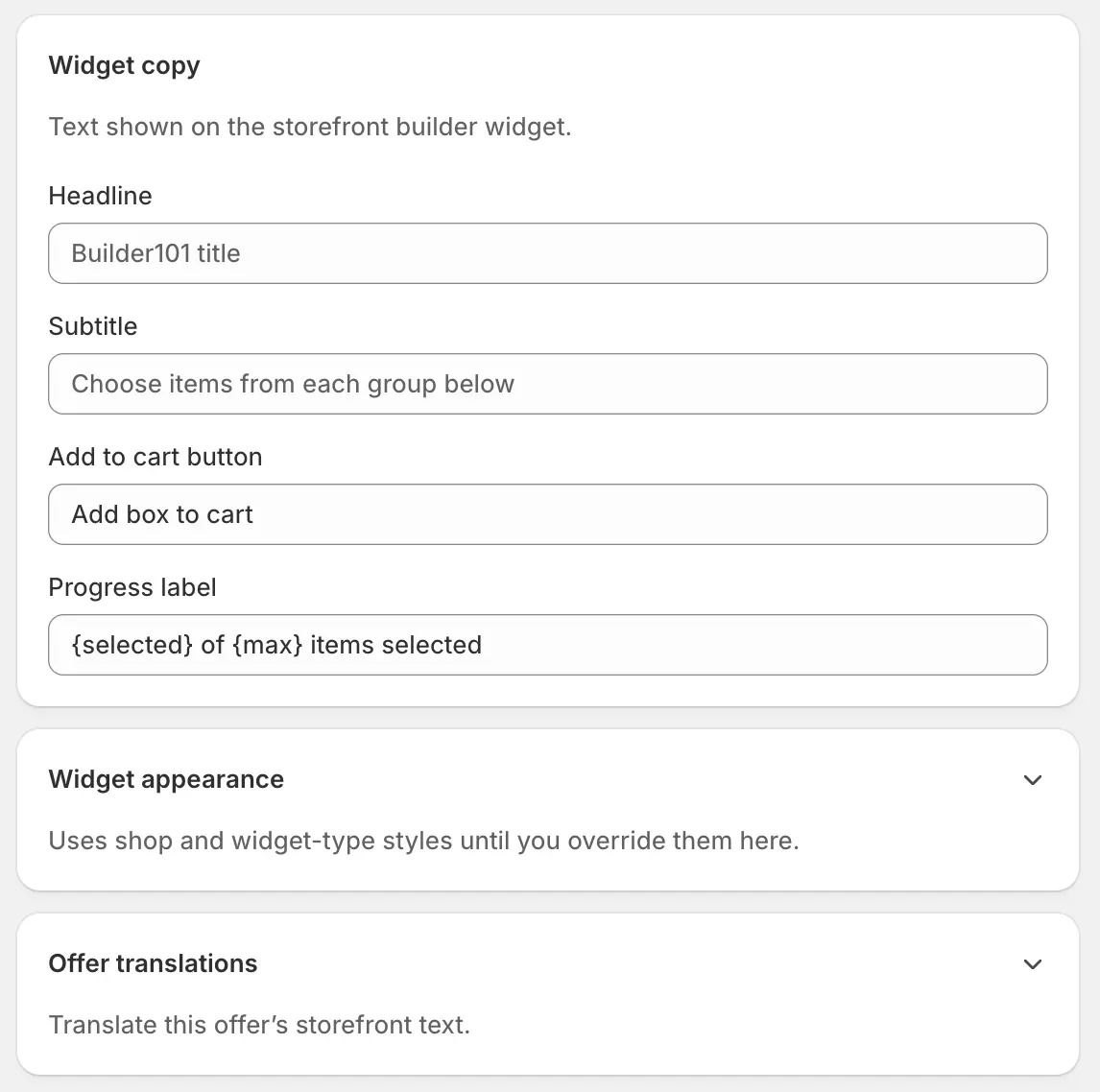
Copy, appearance, and translations
- Headline / subtitle / button
- Widget copy on the builder page.
- Progress label
- Count line such as “{selected} of {max} items selected”. Use those placeholders.
- Widget appearance
- Optional theme overrides for this builder only.
- Offer translations
- Per-language widget copy, section labels and descriptions, product short names, size-tier labels, and (when used) discount messages.
Availability
Optional start and end in shop timezone. Empty means the builder runs until you disable it. Same Active dates behaviour as other types.
Save, enable, and go live
Create, then Enable
Save, then Enable. For expanded display, add the app section on the builder product template and confirm it before expecting that layout.
Wait for Enabled · Live
Open the connected product on the Online Store and build a test box through to cart. Sync badge.